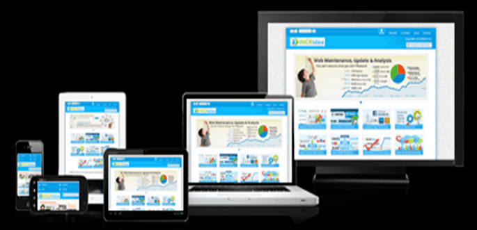
The growth in number of devices and its subsequent influence on the eLearning front has been too obvious to be ignored. It's a multi device world that we live in, and the learners of today are keen on accessing learning on the device of their choice. It's no longer a choice of having eLearning that either runs on desktops or runs on mobile devices. eLearning that runs on desktops, laptops, tablets, phablets, smartphones and any other device thrown into the mix is the need of the hour, which is why responsive eLearning has become so too.
In our earlier posts we discussed about Responsive eLearning design, compared it with Adaptive eLearning and also shared 7 reasons to like it. Here we shall talk about the essence of its importance, three aspects that really make the design model exceptional.
1. One for All
Though this may sound more like a political slogan. This is pretty much what responsive design offers. A single project that can run across different devices irrespective of their size and shape. It all works on the basis of breakpoints that define the output the content gives on different devices. The interaction models, navigation etc. change accordingly too. Not just that, having a single source file make content modification much easier in comparison to making separate changes on individual modules created for different devices. In addition to this tracking the course on different devices can be done from a single point too- making it more user oriented rather than being just device oriented.
2. Freedom of Choice
And this has nothing to do with the constitutional rights of any country. Responsive design gives users the freedom to learn on the device of their choice without learning developers having to worry too much about the output on each. The same learning content can be viewed on any device, at any time or place. This not only gives learning mobility, and helps in utilizing downtime, but also gives continuity. Say for instance a learner starts learning at home on his/her desktop and continues to do the same on his handheld device from just where he/she left it (pause function, and bookmarking) while in transit and switches to tablet or laptop at workplace- responsive design makes this happen. Sequential screening has been observed to be a common pattern since 2012 and in today's date and time the prevalence has just increased.
3. Improved Return on Investment (ROI)
Responsive design helps to achieve a better ROI as one does not have to design the output separately for various devices. Yes,there may be some increase in the testing efforts, however overall development time is reduced drastically and this leads to saving of time, money and have direct impact on go to market strategies. Responsive is onetime investment but worth looking into it as it helps to reduce a lot of rework when it comes to delivering output to a very diversified target audience using multiple devices.
However, Responsive eLearning without a concrete instructional design and graphical backup cannot work miracles. Only a combination of a well-designed course, build in a responsive framework can make it effective. The development can either be custom- where HTML, HTML5, JavaScript, CSS etc. weave the magic, or can be done using Rapid authoring tools like Articulate Storyline, Captivate, Lectora etc. that are known to give responsive output.


