
The world has witnessed quite many technological changes over the years. New discoveries, new inventions and an overwhelming number of devices for convenience. And to top that all Google's emphasis towards the mobile first approach, well for websites at least.
And what happens to eLearning?
What was once CBT (computer-based training) is now Mobile-based, and multidevice. For eLearning to be up to speed, it needs to be user compatible and responsive to devices. And here, Responsive design steals the show hands down.
Opting for Responsive design means, creating a single content source for delivering eLearning to different devices. The content moulds itself to fit the screen size of whichever device the user/learner chooses and more (read about it in our blog - What is Responsive eLearning?). This makes Responsive design widely held for delivering eLearning. However, that's not all. So without further ado, here are our 7 Reasons to Like Responsive eLearning.
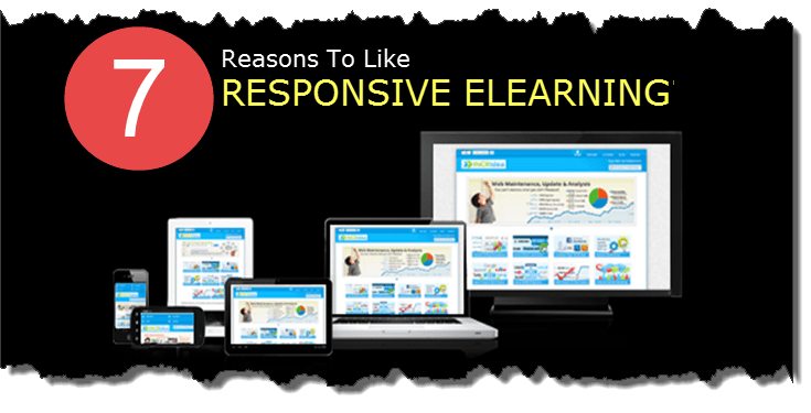
1. Multidevice Compatibility.
It is nothing but the ability to deliver great user-experience across multiple devices and screen sizes is one of the best perk that responsive design offers, giving today's uber multidevice world their freedom of choice.
2. Mobile Friendly.
Well, multidevice says it. But, eLearning has to be mobile friendly and this needs to be asserted as many a times non-mobile friendly content with crammed images and navigation create confusion and frustration amongst mobile users. Responsive design ensures that the content placements, readability, usability etc. is accurate and so is the overall flow of the content- and hence happy learners.
3. Manageability.
eLearning often needs changes in content- if related to something that's constantly changing- let's say software for instance. Single source-single version that can run on any device, less hassles when it comes to changes or modifications. The change once made can be rendered across as seamlessly as ever, hence decreasing the maintenance issues, and not just that eases the testing aspect too to some extent.
4. Anytime Learning.
This supports the mantra - 'Learn anywhere, anytime, anyplace' and points at the freedom it gives in terms of delivery on devices. So, at any point and time eLearning can be delivered on time, even as offline versions to be accessed on-the- run.
5. Cost Effective.
Well, no reason not to love this one. Creating an online course with wide range of interactives and animations or other multimedia elements is often a costly process, in such cases using responsive design really reduces the cost of having to separately build courses for different devices.
6. Greater Reach.
Most users prefer to use their hand held devices and having eLearning that is multidevice compatible ensures that your eLearning will reach all kinds of audience across the globe. So, basically irrespective of the initial target group, having responsive eLearning can ensure that it can be distributed even if there is an organisational expansion or change in policies.
7. Future-proofing.
Technology keeps advancing in a blink, and we have to be prepared for whatever is to come. Responsive design ensure that whichever new device is added into the mix, eLearning can still be delivered seamlessly. It also saves time and cost that we may have to incur in case of last minute design, development, and deployment.
That being said responsive design however does not compensate for the issues related to content conceptualisation, or the coding glitches. What we as eLearning developers need to take care of is how well we present the content, ensure that it meet the learning goals, use the instructional approach right and be sure that responsive design suits the learning requirements before taking the plunge.
From the development point of view, different design layouts may have their own perks. However, we hope this post helps you when you weigh the design styles for your next eLearning project.
