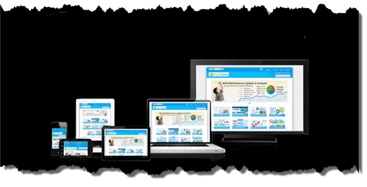
In our last post we gave an overview of the multi-device ecosystem and its influence on eLearning, and also discussed about 3 types of multi device experience that can be delivered. We had mentioned that we will be discussing the design, development and testing considerations. As we have already discussed about the aspects of multi-device eLearning testing in an earlier post, we will be covering the design and development considerations here.
Any eLearning design as always begins with analyzing the requirements. It is inadvisable to jump on to the eLearning bandwagon unless absolutely necessary. Once that's sorted content gathering comes in next as usual, followed by validation by an SME and then comes the designing stage. Here are some key aspects to be considered:
Identify the Approach
Understand the learners, their device usage pattern and then decide on what kind of experience you wish to deliver - Consistent, continuous or complementary. Most organizations tend to opt for Responsive/consistent experience as it means creating a single source that can run across multiple devices, however that need not be the case always.
Keep in mind the range of Devices
Multi device doesn't always mean throwing in all devices into the mix. In some cases, the organizations may only need courses that run on desktops and tablets, while in other cases they may need only desktop and mobile-bases courses. The approach differs for both as the content designed for desktops usually runs smoothly on tablets but not much on mobiles. In the latter case, a mobile first approach is usually more feasible.
Content
This has more to do with storyboarding and the approach chosen. The experience you wish to deliver, determines the type of presentation. The thing with different devices is that the content is no longer static with just next and back buttons, it has to be more fluid and dynamic unless you plan on squeezing all the information into the screen. The colors used (should be similar across platforms), the amount of textual content shown on the screen, the instructions (part of storyboarding), font size, images and other visual elements included should all support the different devices in the mix.
Navigation Style
Consider the type of navigation that applies for different devices. For desktops it may be next-back or explorative, while for tablets and mobiles it has to be touch-based, include scrolling, tapping etc.
Once the storyboarding is done and the design aspects narrowed down comes the actual development phase. There are many authoring tools available that do give responsive/multi device output and can save a lot of development time. But, if your organization requires a custom made project then HTML- based courses are your best bet.
When creating courses for multi device usage, the following tips may come in handy.
- Include dynamic layouts to ensure that the elements fit into different screen sizes
- The experience should be relative on different platforms- Colors used, button styles etc.
- Keep the font size readable (16px is the standard these days)
- Images should be scalable, JPEG, GIF and PNG-8 file formats can help in optimization
- Touch friendliness- can't be ignored right
- Fall-back options can often come in handy (i.e. Flash- based animations for certain browsers)
- Keep the design clean. A file cluttered with unwanted codes usually affects the loading time
Any multi device eLearning created also should be tested thoroughly before being deployed. Testing them on actual physical devices is most advisable, but simulators and emulators give good results too.
Hope that this helps you in gaining better clarity about the overall process of developing eLearning in a multi-device ecosystem.
At Knowzies, we have both the experience and expertise in creating and testing multi-device eLearning. Feel free to contact us for any queries.


