Ever participated in building construction? Leave that alone, have you looked at building plans (home/commercial)? For those who know what I am talking about, the layout or the plan is the first peek into how the building will shape up. For those who are yet to explore this arena, think in terms of a costume sketch. The colours, the design, the drape pattern, even the tiny details are often etched on the sheet of paper first before being transferred onto cloth and stiches. The sketch acts as the first visual manifestation of the design/concept.
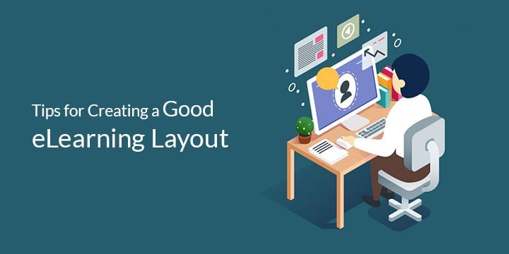
Quite similarly, eLearning too begins with a plan. While very often we refer to the instructional design aspect and it also covers the structure and design framework for the course. While we often talk about the content, the layout looks at how the content is presented. While eLearning mostly has a common layout for standard courses, the layout is often tweaked to fit the likes of different learners/users.
So, what makes a good eLearning layout?
Let’s begin by looking at the standard components of an eLearning course. A typical eLearning module includes:
- Introduction
- Table of contents (when the course is lengthy)
- Objectives/goals
- General instructions (navigation, controls etc.)
- The Actual content (interactivities, scenarios and so on)
- Quizzes, assessments, and surveys
- Summary and Feedback
- Further Instructions (if applicable)
Each of these elements play a role in how the final eLearning looks, works and appeals. Here are a few tips on how to shape each of these to create a good eLearning layout.
Introduction
While the whole purpose behind having a layout is that it can be reused, however with self-paced and personalized learning in considerations, quite often this may not be the case. So, what can make introduction interesting? Well, good illustration and interface can weave magic, but that alone may not do the trick. Along with the interface, the content too has to be interesting. Very often a story telling like introduction leaves a better impact than a simple text and image-based intro. Video-based intros are gaining popularity too.
Objectives/Goals
Skipping the table of contents, apart from using good Fonts and graphics there id not much to do here. And the layout pretty much remains the same. Moving on the next layout design is for the Objectives or Goals, while many courses have this as simple text, using a video to show the actual impact could be a positive change.
The Actual Content
The layout for this is entirely designed during instructional design. While similar courses can be built using eLearning templates, the custom courses usually have a consistent theme and style that matches the overall requirements. The key however, lies in good content gathering, analysis and instructional design.
Quizzes, Assessments, and Surveys
Here again very often a template is used. However, with as most quizzes and assessment it can either be multiple choice, drag and drop, match the right pair etc. Surveys too often follow a fixed style.
Summary and Feedback
This section can be different for different learning requirements. In some cases, it consists of just the summary, or key points/highlights listed as bullets, in other cases it sums up the general learning aspects. The feedback too can either be in terms of score, performance review or just a simple compliment
In terms of custom design creating a good layout could be helpful when different courses are to be created with the same layout. However, with rapid learning or eLearning created using authoring tools, the layout depends on the templates available. While those can be customized, the template library usually has great many options to choose from hence, decreasing the need for customization.
So, what kind of a layout would you opt for? Do share your thoughts.